Overview
Etsy External Listing Page
Finding the right balance between product discovery and purchase intent.
−23%
Bounce rate
+2.07%
Conversion rate
~$17M
Annualized sales
- Role
- Design Lead
- Company
- Etsy
- Year
- 2025
- Platform
- Mobile web
- Method
- Experimentation + concept testing
- Status
- Shipped
I led discovery and design for the mobile web External Listing Page alongside my Product partner, working with Engineering, Research, Analytics, Design, and leadership to understand the existing experience, identify opportunities, develop new directions, and iterate through experimentation.
The challenge
Helping buyers evaluate an item without ending their journey there
External Listing Page is an important entry point for buyers arriving at Etsy from external channels. Mobile web is the most-used platform for these landing experiences, making it a critical place to understand how external buyers enter and continue their Etsy journey.
The experience has to do two things well: give buyers enough information to evaluate the listing they came for, while helping them continue exploring when that listing isn’t quite right.
When I joined the Landing Experiences team in late 2024, External Listing Page already had years of experiments, research, and product decisions behind it. My first challenge wasn’t to redesign the page. It was to understand what the team already knew—and where meaningful opportunities still remained.
01
A product with history
I reviewed existing Design, Product, Research, and Analytics documentation to understand the current state of the product and the decisions and learnings that had shaped the External Listing Page over time.
This helped me build context around previous experiments, buyer behavior, existing product decisions, and opportunities that had been explored but not necessarily implemented.
02
A tension between evaluation and discovery
Buyers landing on a listing need enough information to decide whether it’s right for them. But not every visit begins with a clear purchase mission, and the listing that brought someone to Etsy may only be the beginning of their exploration.
How much should an External Listing Page help buyers evaluate the listing they landed on—and how much should it help them discover what else Etsy has to offer?
03
Joining an established team
I was also entering a long-established, engineering-heavy team that had limited experience working directly with Design.
Before we could collaborate effectively, I needed to understand their workflows while establishing a shared way of working with design tools and artifacts.
I ran a couple of practical sessions introducing our design process, Figma, and Dev Mode so the team could more easily inspect and implement the work I would be bringing into the product.
Key decisions
01
Build a shared model before changing the page
Before exploring a new mobile web External Listing Page, I wanted to understand what the existing experience was already doing.
Working closely with my Product partner, I synthesized what we knew from existing Design, Product, Research, and Analytics documentation and brought the broader team into the discovery process through brainstorming sessions and a design jam with other designers.
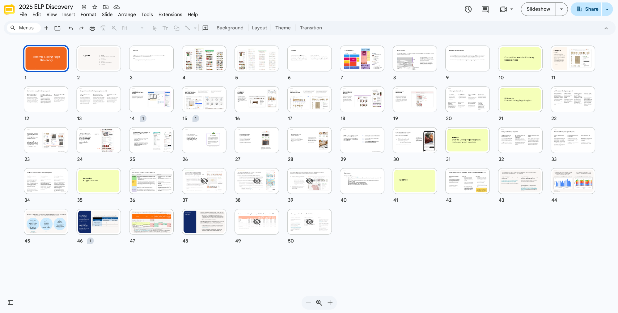
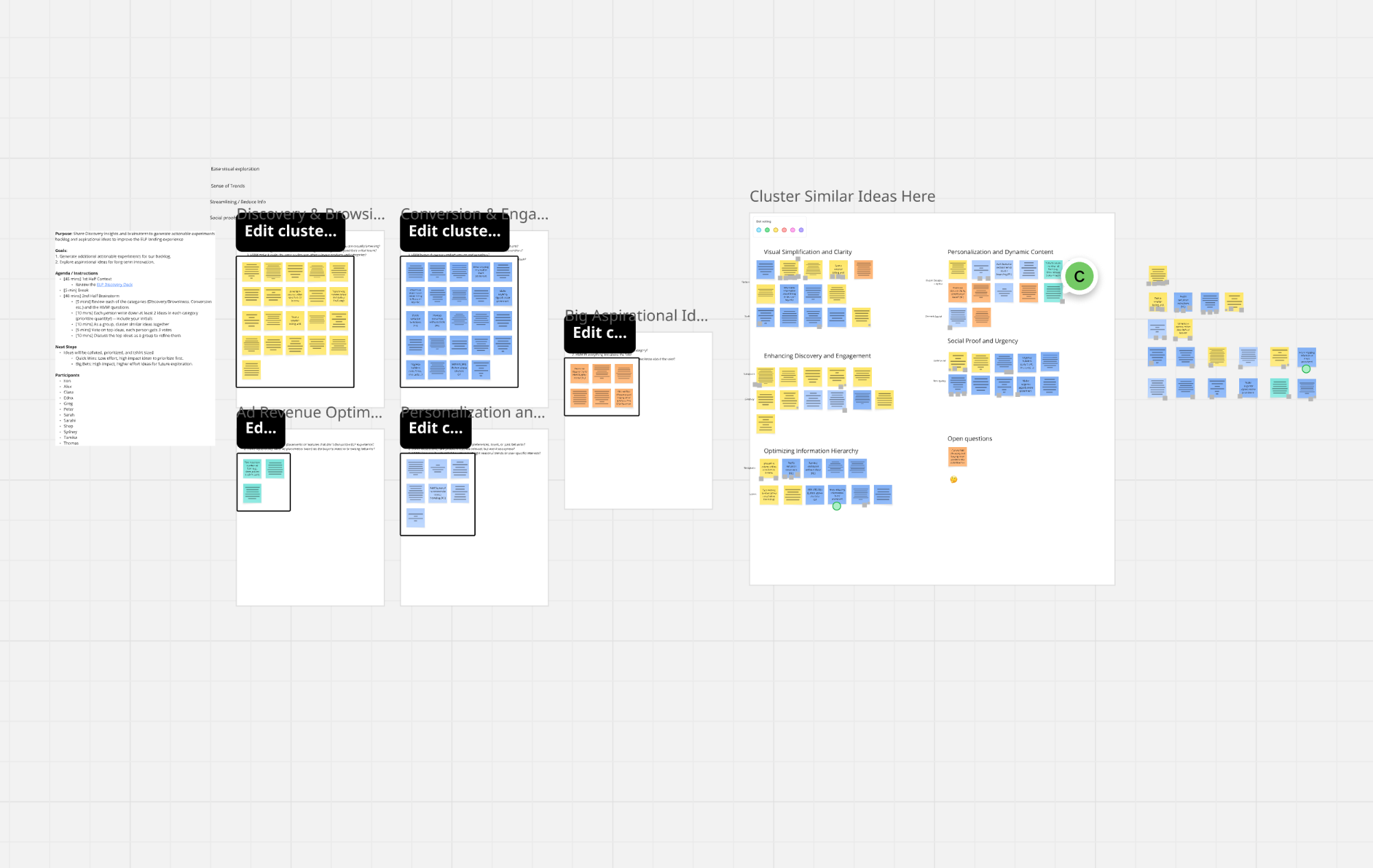
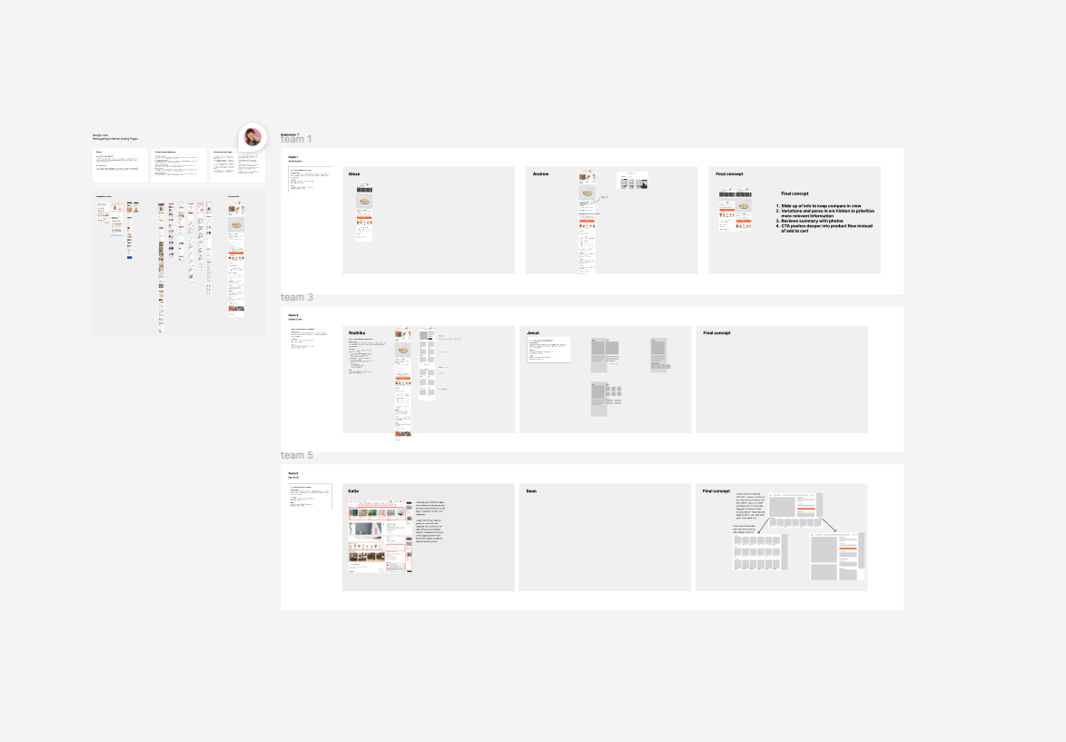
Selected artifacts from collaborative discovery and exploration. One artifact became particularly useful: an anatomy of the existing External Listing Page.
Rather than simply documenting the interface, I mapped individual parts of the page against the signals we had about their impact—including conversion, listing views, clicks, interactions, and other available measures.
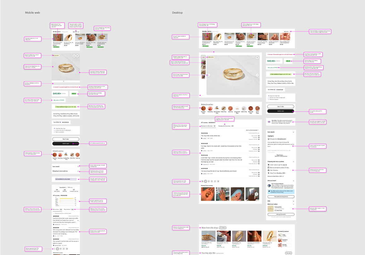
Building a shared model of the existing experience. I mapped the anatomy of the page against known behavioral and business signals, turning existing product knowledge into something the team could reason about together. This gave us a better foundation for asking not simply what we could change, but what role each part of the page should play in the buyer journey.
02
Treat browsability as a spectrum
Through discovery and conversations with Design leadership, one opportunity kept resurfacing: buyers needed enough information to understand the listing they had landed on, but they also needed ways to continue their discovery.
Instead of treating the problem as a choice between a traditional listing page and a discovery experience, I started thinking about browsability as a spectrum.
How browsable should a mobile web External Listing Page be?
I developed a spectrum of possibilities that explored different balances between the anchor listing and pathways into broader discovery.
Less browsableMore browsable
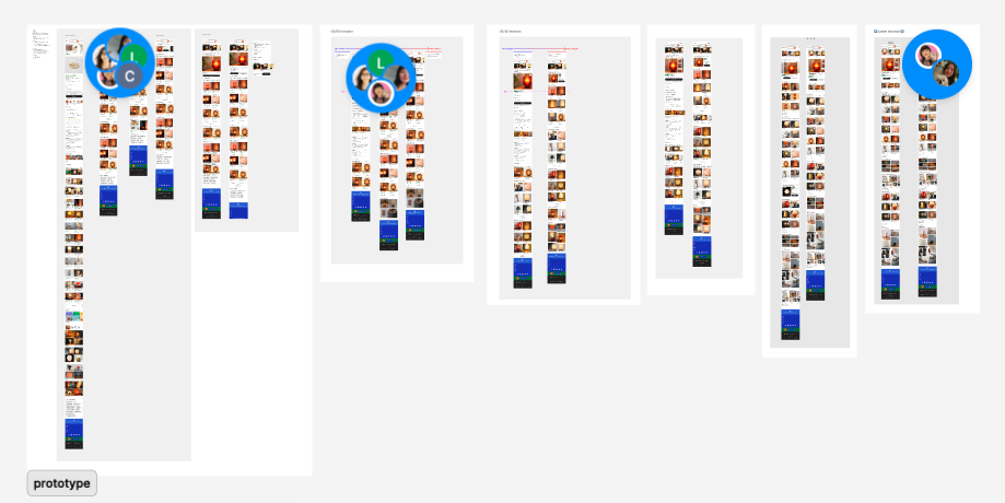
Exploring the balance between evaluation and discovery. The spectrum helped us reason about the External Listing Page as a continuum rather than choosing between a listing page and a browsing experience. Testing the hypothesis
Our first experiment with a more browsable mobile web External Listing Page showed a clear change in buyer behavior.
Existing experience
First experiment
Engagement improved
−3.2%
Bounce rate
+3%
Engaged visits
+5.3%
Pages viewed per visit
A significant trade-off
−4.5%
Conversion rate
−4%
Sales per visit
The result was mixed, but useful.
Buyers were engaging more deeply with the experience, while the impact on conversion told us we hadn’t yet found the right balance between discovery and purchase intent.
Rather than treating the result as a simple win or loss, we continued exploring the opportunity to make discovery more useful without compromising buyers’ ability to evaluate and purchase.
Outcome
Finding a better balance between discovery and conversion
The redesigned mobile web External Listing Page made a more substantial shift toward discovery while preserving the information buyers needed to evaluate the listing that brought them to Etsy.
The experiment exceeded our expectations.
−23%
Bounce rate
+2.07%
Conversion rate
~$17M
Annualized sales
Additional impact included +2.11% purchase frequency, +1.73% sales per visit, $6M in additional Ads revenue, and a 14% improvement in page-load performance.
Following the successful experiment, the redesigned External Listing Page was ramped across external traffic channels on mobile web.
The experience
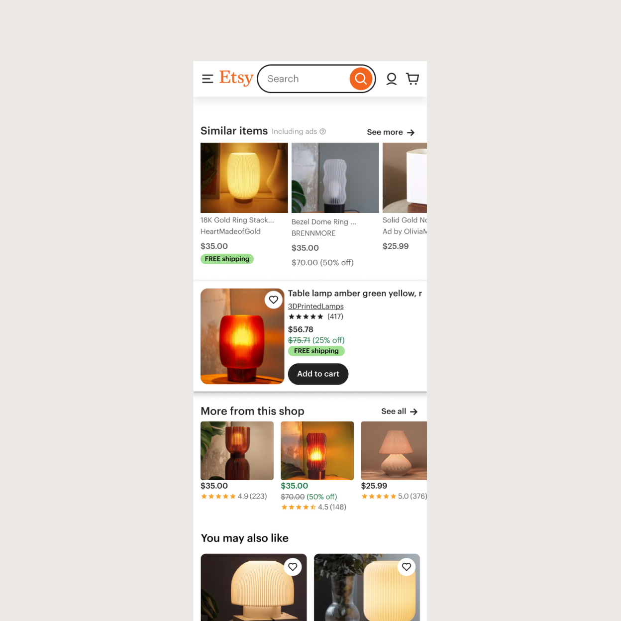
The outcome challenged the assumption that discovery and conversion had to work against each other.
Our first experiment increased exploration at the expense of conversion. The final experience showed that, with the right balance, a more discovery-focused landing experience could improve both.
Looking back
You can’t improve a system you don’t understand.
External Listing Page already had years of experiments, research, and product decisions behind it. Understanding that history before designing helped me distinguish between what needed to change, what was already working, and where there was still room to explore.
A mixed result can be more useful than a clean win.
Our first experiment improved engagement while hurting conversion. Rather than reducing the result to a win or loss, we used the tension to sharpen the problem: buyers wanted more ways to explore, but we still needed to protect their ability to evaluate and purchase.
Joining a new team means learning how the team works, too.
Moving into a new domain meant learning more than buyer behavior. I also had to understand how an established team worked, what they expected from Design, and where I could make collaboration easier. Building that shared language helped me move from being new to the space to contributing meaningfully within it.